Below is a link to my response to the third evaluation question:
http://www.slideshare.net/ekaetegb96/evaluation-question-3-47367619619
Saturday, 31 January 2015
Friday, 30 January 2015
Evaluation Question 2: How effective is the combination of your main product and ancillary tasks


A part of our brief was the importance of our ancillary tasks relating to our main product (the music video) and create three products that easily complimented each other and showed correlation.
I feel I successfully achieved this quota and throughout my products there is clear consistency and someone viewing them for the first time can see they are related. All three products feature similar aspects and display fluency. If a member of my target audience had only seen one of these products and proceeded to see the other two on different occasions, they would be able to identify and link them together, through the persistent house style, colour scheme etc.l
Tuesday, 20 January 2015
**FINAL PRODUCTS**
MUSIC VIDEO
4 PANEL DIGIPAK
Front Cover

Back Cover

Middle of Digipak

Lyric Book (inside digipak)

PROMOTIONAL MAGAZINE ADVERT

Saturday, 17 January 2015
Creating the digipak
Front Cover
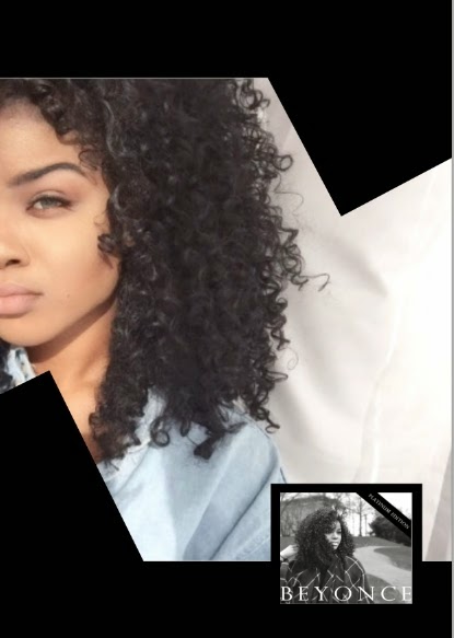
1) I decided on using this photo for the cover of the digipak, however I wasn't fond of the colours used as they didn't represent anything in particular, however, the black and white was present in the video for the flashback scenes, so I proceeded to make the image black and white and used the toggles to balance the tones (as seen below). 


2) The next thing I did was add the font. Following my font research and the feedback I received from my questionnaire, I decided on a large font that stretched across the album cover in the simple "Perpetua Titling MT" font.
3)I then added, a band across the right of the front cover that read "Platinum Edition" in order to add some authenticity to the album.


I used the shape tool to create a rectangle and then created a new layer to add the text, I then merged them together in order to skew them diagonally on the front cover
4) Next, I used the "Rectangular marquee tool" to create a rectangle in which I would copy and paste the "Explicit Advisory" sticker, again this is used to authenticity and is also featured on Beyonce's album as the disc does feature topics of explicit and sexual nature that is inappropriate for younger audiences.

Middle of digipak
1) For the digipak I first created a template on which I would create both sides of the digipak.

2) I then had to cut a circular image from the front cover image to use for the CD art, Beyonce's CDs usually have the same image from the front cover on the actual CD, so I took this approach when I created my CD.

3) I decided following the feedback from my questionnaire to insert a lyric book into the middle of my digipak, so I used the same image from the front cover and the cd itself and used the same font to write "lyric book" as opposed to Beyonce.


On the sleeve I wrote "From Beyonce, with Love x" using a font which mimicked a handwritten note, again this was to add a personal effect the digipak and also to use the space as the digipak felt slightly bare.
I used the pen tool to scribble an imitation of Beyonce's signature on the lyric book as this is often used on items inside the digipak to make the buyers feel they are getting something personal from the artist themselves.
4) Lastly I added a sleeve in which the lyric would be held using the shape tool and skewing it so it fitted diagonally across the digipak.
Back Cover
1) Like the front cover I first blurred the background using the blur tool, and then proceeded to add the black and white, toggling the settings so it matched the front cover perfectly. I chose this picture as it features Fatou in the background, which relates to what the actual music video is going to be about.

2) I then added the track listing, in a row which is how Beyonce's self titled album's track listing is displayed. I used white for this, as it stood out the most against the background and it was the colour I used for the rest of the digipak so it showed consistency throughout the product.

3) I inserted text at the bottom regarding the album rights, companies involved in the production of the album etc. The barcode was also inserted, using an image from Google images. The barcode adds the authenticity to the product as all real products feature a barcode enabling them to obviously be bought.

The back of the digipak did not take too long to create as I wanted to continue with the minimalistic style of the digipak in general.
Wednesday, 14 January 2015
Creating the magazine advert
1) This was the picture I chose to use for the magazine advert as often in music magazines there is a large picture of the artist alongside their album cover. Also my audience feedback from my questionnaire showed that people prefered a large image of the artist for the magazine


3) I then added two rectangle shapes using the "shape tool" and skewed them to frame Maritta's face and make the advert more visually appealing.


4) Next, I added a smaller image of the album cover to the bottom right corner, as my magazine advert was promoting the release of "Beyonce's" new album.

However, after placing it, I felt the top half of the album cover image clashed too much with the background of the main image making it difficult to see. So again using the "shape tool" I created a square which I placed the album cover on top, making it act as a border around the image so it was easier to read.

5) I then proceeded to add the text using the "Horizontal type tool" to the top of the advert.

I used the same font that is on the front of the album cover to show continuity between the products and also to show familiarity to Beyonce audiences when they see this in the magazine.
6) I then added the social media logos in the bottom right corner and again this adds authenticity to the advert as it is feature which is frequently used due to the rise and popularity of social media in the present day

7) I then added the text regarding the release date of the album, but used a different font so it stood out from the font used for "Beyonce"

8) I felt the white background on the main image looked bare and decided to add some reviews as this was also something that was used on magazine advert to show potential customers that they were getting quality products

9) After finishing the advert, I was concerned that the image looked too washed out and decided to increase the saturation of the image, I then decided to add a black and white filter. To help me, I gathered a small focus group consisting of 3 classmates and my teacher and we actually collectively decided to use the colour image instead, as we felt there would be too much black and white on the advert.
Black and white:


6) I then added the social media logos in the bottom right corner and again this adds authenticity to the advert as it is feature which is frequently used due to the rise and popularity of social media in the present day
7) I then added the text regarding the release date of the album, but used a different font so it stood out from the font used for "Beyonce"
8) I felt the white background on the main image looked bare and decided to add some reviews as this was also something that was used on magazine advert to show potential customers that they were getting quality products
9) After finishing the advert, I was concerned that the image looked too washed out and decided to increase the saturation of the image, I then decided to add a black and white filter. To help me, I gathered a small focus group consisting of 3 classmates and my teacher and we actually collectively decided to use the colour image instead, as we felt there would be too much black and white on the advert.
Black and white:
Colour:
Tuesday, 13 January 2015
Magazine advert first draft

This is my first draft for my magazine advert. I asked people on my social media accounts for their views and opinions and also set up a focus group with my friends in order to gather their thoughts on the initial draft.
POSITIVES
- They liked the image and the word "Beyonce" at the top, as it was eye catching and made a statement. It also matched the font on the album cover so it showed correlation.
- They found the inclusion of the album cover good as it allows the advert to be instantly recognized as a music advert.
- All the feedback particularly liked the smaller text at the bottom. As they said it is something that also adds authenticity to the advert as most magazine music adverts they see have, a line or so about the highlights of the album.
CONSTRUCTIVE CRITICISM
- Both the girls in the focus group and the online feedback, felt that the white writing at the bottom was fairly difficult to read against the light coloured top Maritta was wearing. To fix this issue, they advised, I use a darker colour, either black or another one.
- The found the white space between the two black banners to be distracting and bare and suggested I insert something there, like ratings, an image, the price of the album etc.
- Perhaps edit the picture slightly so, it looks less "washed out", maybe increase the contrast so the image has more depth
All in all, I received very helpful feedback, in both telling me what was already positive with the advert, but also specifically what I could do to improve it.
Saturday, 3 January 2015
Font decisions for Digipak

After examining previous album covers of Beyonce's to explore her use of text and fonts, there was an apparent theme that was clear to see throughout the albums. They featured very little text and Beyonce's name is always the main feature, as opposed to the song or album name or single name which is always less prominent and smaller. She always also uses a very simple font and the text is always spelt using capitals, as seen above in the four album cover crops.
Prior to this however, she did appear to experiment with different fonts as seen in her 2004 and 2006 album covers below, but after that she adopts her trademark "capital letters and simple fonts" approach we see today, perhaps as a sign of maturity or solidifying her status as a successful and well known artist.


This font would be inappropriate as it is too childish and does not match Beyonce's current, sophisticated style of font.

This font is too masculine, and does not represent Beyonce's feminine but bold style so it would not be appropriate for the album cover

This font is in lowercase, and definately is not right as Beyonce's image is supposed to represent her strength and domination and this font does not reflect that image.

This Perpetua Titling MT font would be perfect for the digipak as it flows with her previous work and is a perfect embodiment of the Beyonce image and brand.
Friday, 2 January 2015
Photos


These are the still photos which were taken on set for the front of my album cover, there aren't many, as I planned to use stills from the video itself to show correlation between the digipak and front cover.
Subscribe to:
Comments (Atom)