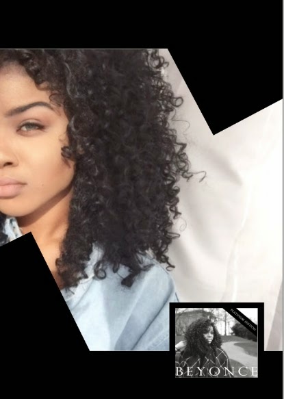
1) This was the picture I chose to use for the magazine advert as often in music magazines there is a large picture of the artist alongside their album cover. Also my audience feedback from my questionnaire showed that people prefered a large image of the artist for the magazine


3) I then added two rectangle shapes using the "shape tool" and skewed them to frame Maritta's face and make the advert more visually appealing.


4) Next, I added a smaller image of the album cover to the bottom right corner, as my magazine advert was promoting the release of "Beyonce's" new album.

However, after placing it, I felt the top half of the album cover image clashed too much with the background of the main image making it difficult to see. So again using the "shape tool" I created a square which I placed the album cover on top, making it act as a border around the image so it was easier to read.

5) I then proceeded to add the text using the "Horizontal type tool" to the top of the advert.

I used the same font that is on the front of the album cover to show continuity between the products and also to show familiarity to Beyonce audiences when they see this in the magazine.
6) I then added the social media logos in the bottom right corner and again this adds authenticity to the advert as it is feature which is frequently used due to the rise and popularity of social media in the present day

7) I then added the text regarding the release date of the album, but used a different font so it stood out from the font used for "Beyonce"

8) I felt the white background on the main image looked bare and decided to add some reviews as this was also something that was used on magazine advert to show potential customers that they were getting quality products

9) After finishing the advert, I was concerned that the image looked too washed out and decided to increase the saturation of the image, I then decided to add a black and white filter. To help me, I gathered a small focus group consisting of 3 classmates and my teacher and we actually collectively decided to use the colour image instead, as we felt there would be too much black and white on the advert.
Black and white:


6) I then added the social media logos in the bottom right corner and again this adds authenticity to the advert as it is feature which is frequently used due to the rise and popularity of social media in the present day
7) I then added the text regarding the release date of the album, but used a different font so it stood out from the font used for "Beyonce"
8) I felt the white background on the main image looked bare and decided to add some reviews as this was also something that was used on magazine advert to show potential customers that they were getting quality products
9) After finishing the advert, I was concerned that the image looked too washed out and decided to increase the saturation of the image, I then decided to add a black and white filter. To help me, I gathered a small focus group consisting of 3 classmates and my teacher and we actually collectively decided to use the colour image instead, as we felt there would be too much black and white on the advert.
Black and white:
Colour:
No comments:
Post a Comment